Branding

Flux
Design studio based in Dubai. Calm interiors & thoughtful spaces.
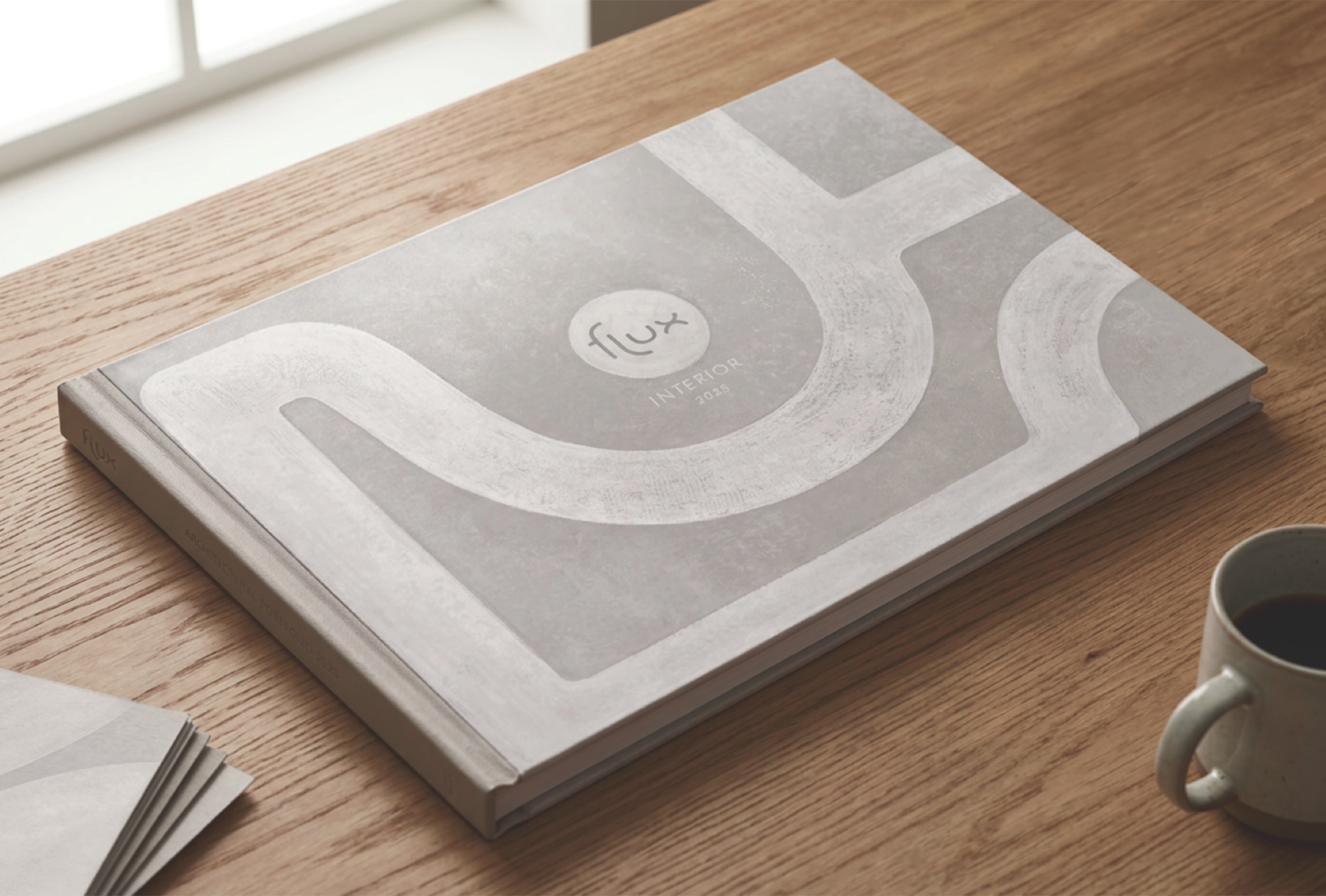
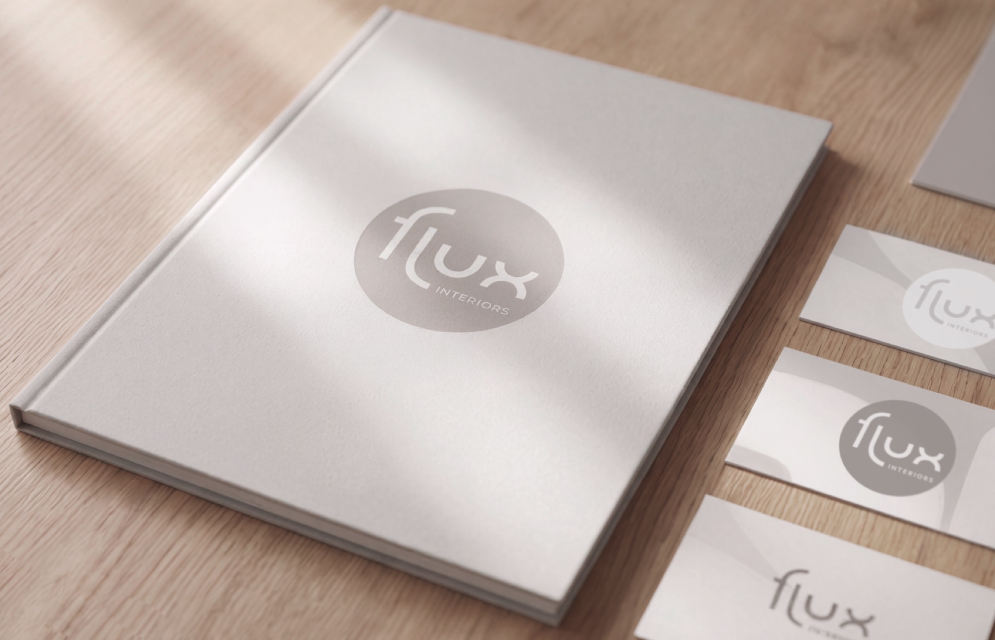
A visual identity for an interior architecture studio in Dubai. The logo grew out of a motif found in the studio's own projects — the arch and the softened corner — so the mark reads as an extension of their spatial language rather than graphics applied on top of it. The project also included a template system for architectural albums, which unified the studio's presentation format and let the team assemble a client-ready album without a separate layout stage, and business cards with a QR code linking straight to the studio's portfolio.






OCHO
Argentinian bar.
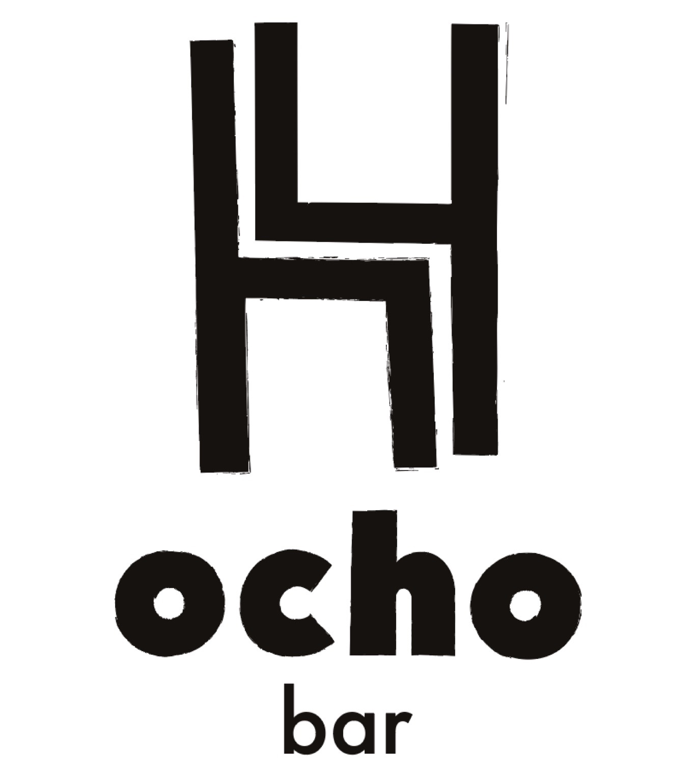
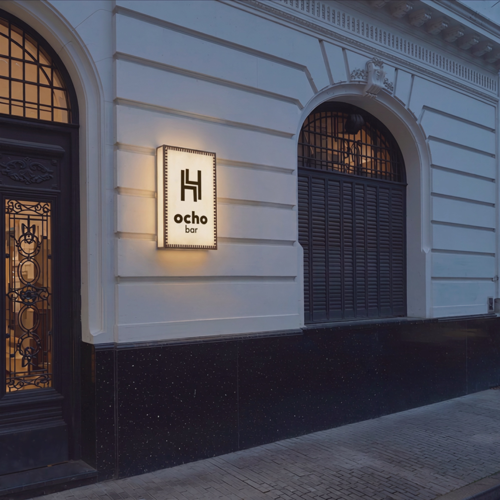
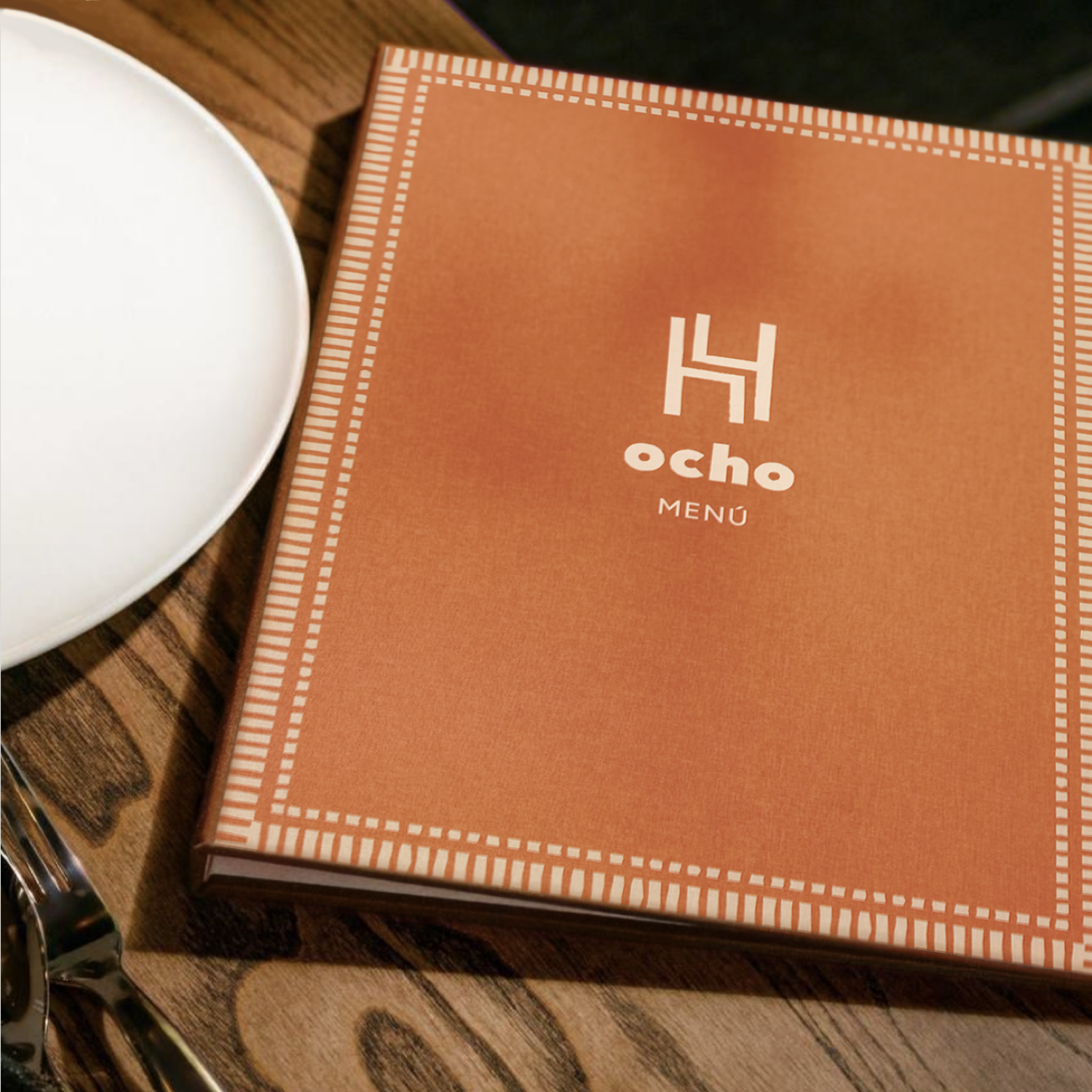
The owners are constantly running quizzes and games of Mafia, so I wanted the mark itself to be a small puzzle. At first glance it reads as two chairs pushed together — the quiet, unhurried image of a room after the party. Look again and it's two fours, adding up to eight: ocho, the name itself. The client came to me mid-renovation, with colors, materials and the concept still shifting, so I developed the final graphic layer once the interior was finished — tying the mark to the space it ended up being.


Anna Nemolayeva
Clutches made from geisha obi.
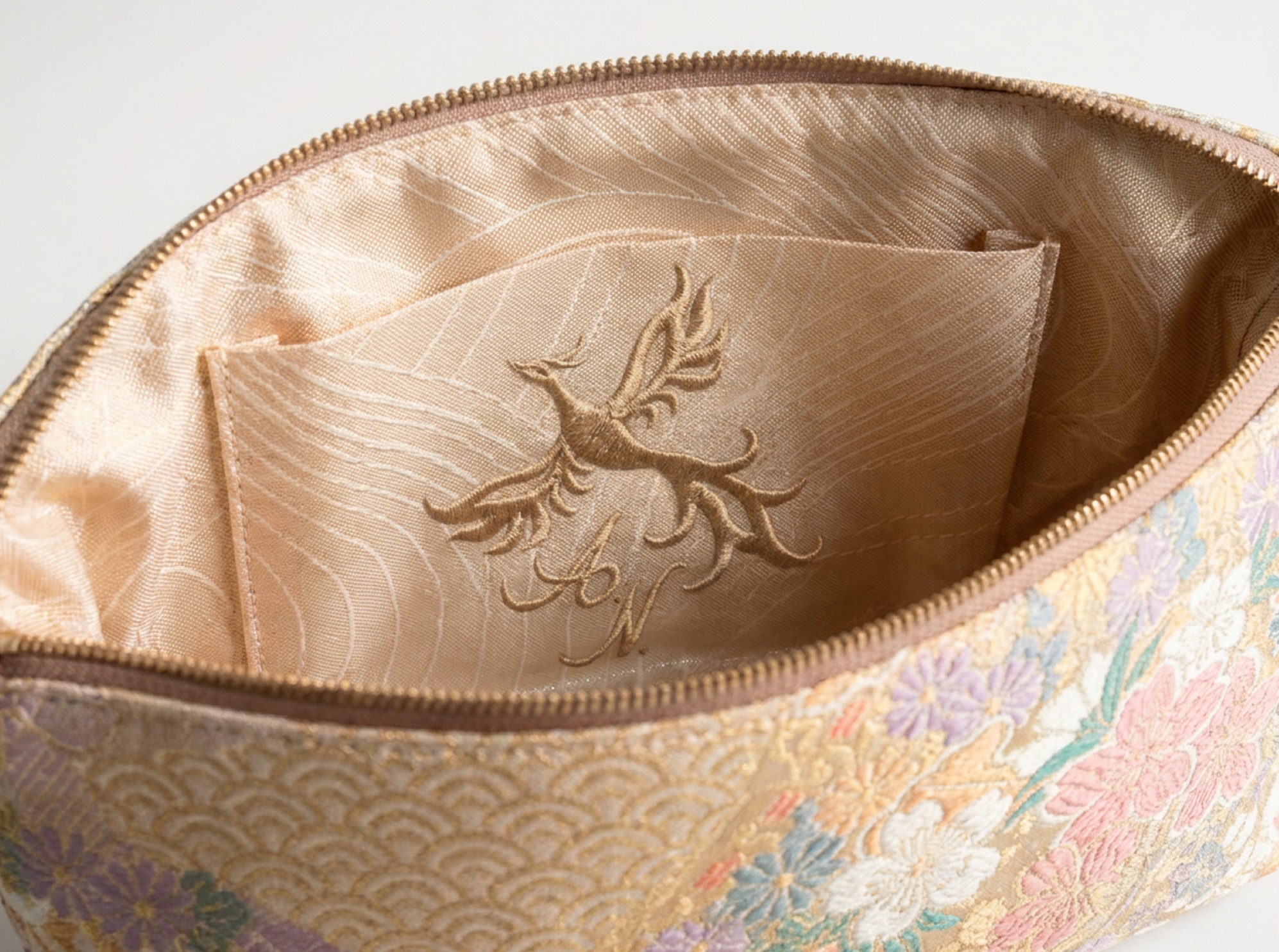
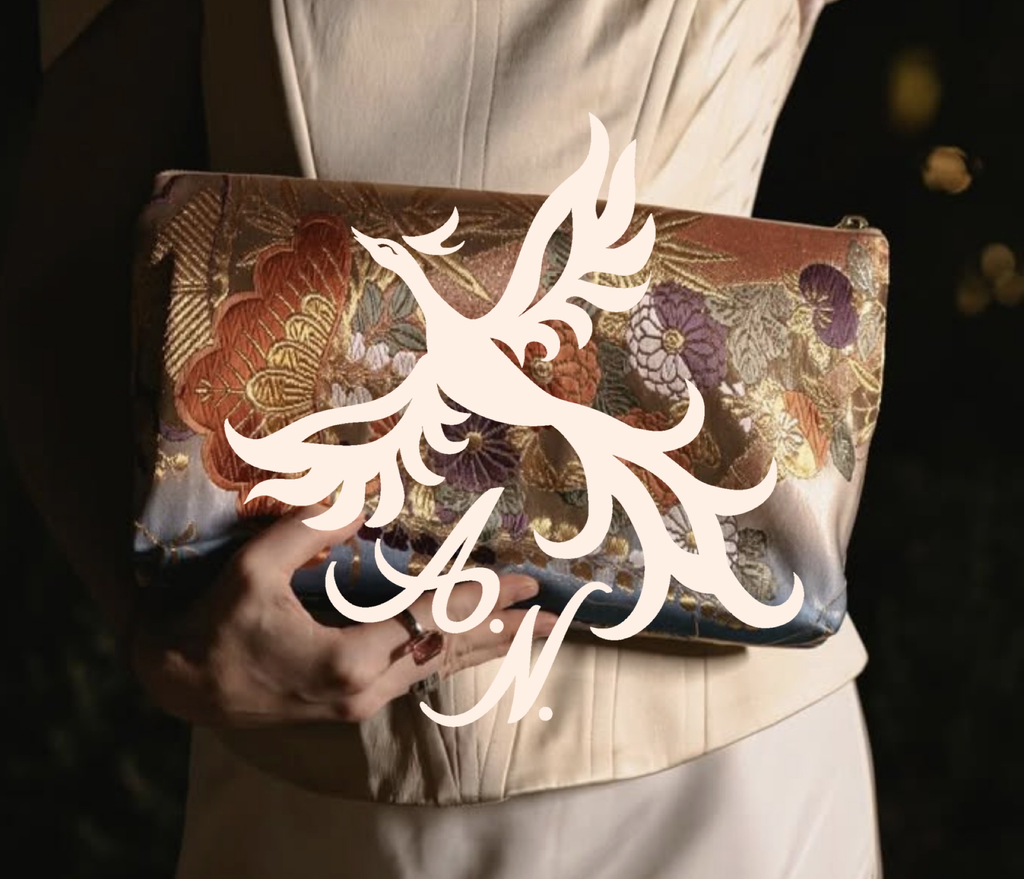
Anna N. is a personal logo for a label making clutch bags from geisha obi belts, each paired with a deck of fortune-telling cards. The mark needed to carry that same air of magic and fable, so I drew it straight from the material itself — the phoenix embroidered into the belts the bags are cut from. As the work went on it took on the traits of the Firebird of Russian folklore, reflecting the client's own Russian origins, and the Japanese motif met the Slavic one. The handwritten initials add a sense of secrecy — like a signature on a letter from a stranger.

Audiocoloring
Coloring books to listen to.

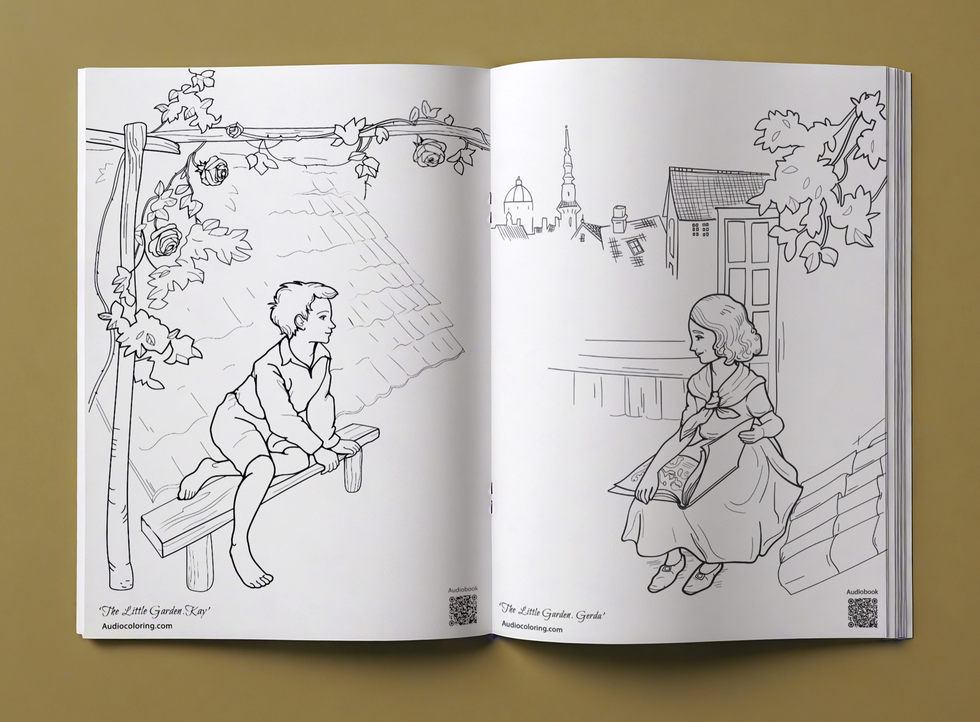

Audiocoloring brings together two quiet activities: coloring and listening to an audiobook. Together they take up the mind completely — the hands are busy, the ear follows the story — and there is no room left for anxiety.
The mark is a next-generation bookworm: he has grown ears, because now he listens too, and holds a brush, because he colors as he goes.
The coloring pages bring the masterpieces of the old masters back to life — their fine detail and elegance, drawn with the freedom of contemporary illustration.

Juna
Activewear and lifestyle brand.
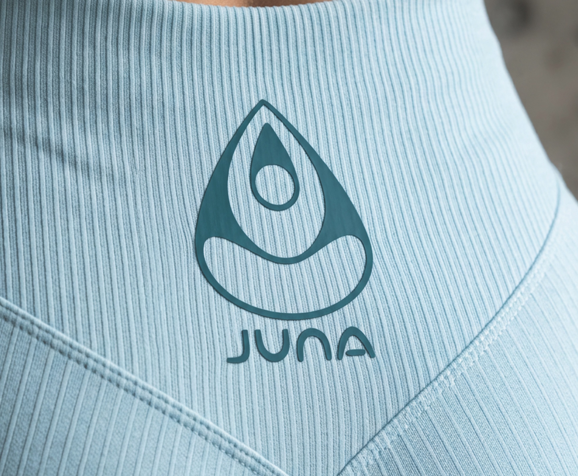
Juna makes activewear from soft, comfortable fabrics. The clothes do not press, slide or rub — in yoga, running or ballet. The main idea of the brand is to be gentle with the body.
So the logo is about care, not physical effort. It shows a woman inside a soft aura — a cocoon in the shape of a drop. Her pose is calm and turned inward: a quiet moment with yourself, when nothing distracts you.


Panacea
Herbal blends.
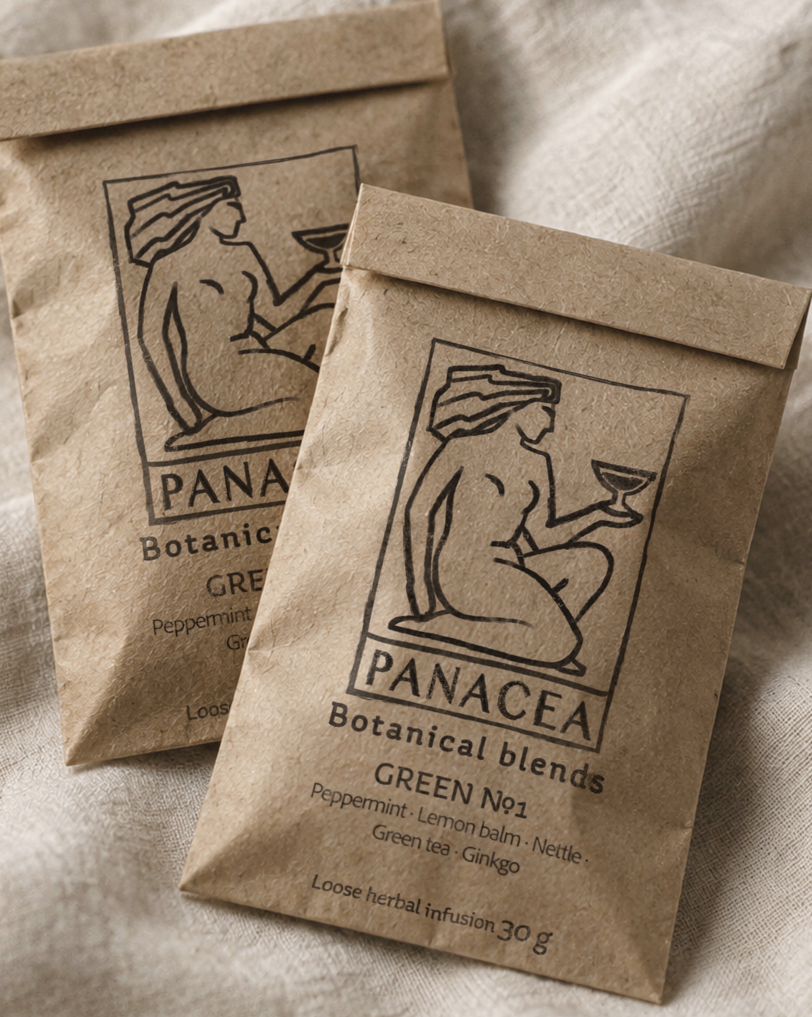
The brand makes herbal blends — something people were brewing long before pharmacy existed. The brand wanted that age to come through in the mark, so the logo was drawn in a vintage style.
In its modern sense the word "panacea" promises instant relief from every ailment at once, which could easily have cost the brand its credibility. So I took the name back to its origin — Panakeia, the Greek goddess of healing. The logo returned the name to a symbolic register: it removed the promise of curing all ills and left only a hint of it. And the link to Greek myth gave the brand a sense of history.
Tkdemy
Taekwondo learning app.
Tkdemy is an app for learning taekwondo: quizzes, training programs and progress tracking. My part was the logo, the visual identity and the structure of the learning — how the lessons are organized and the world they live in.
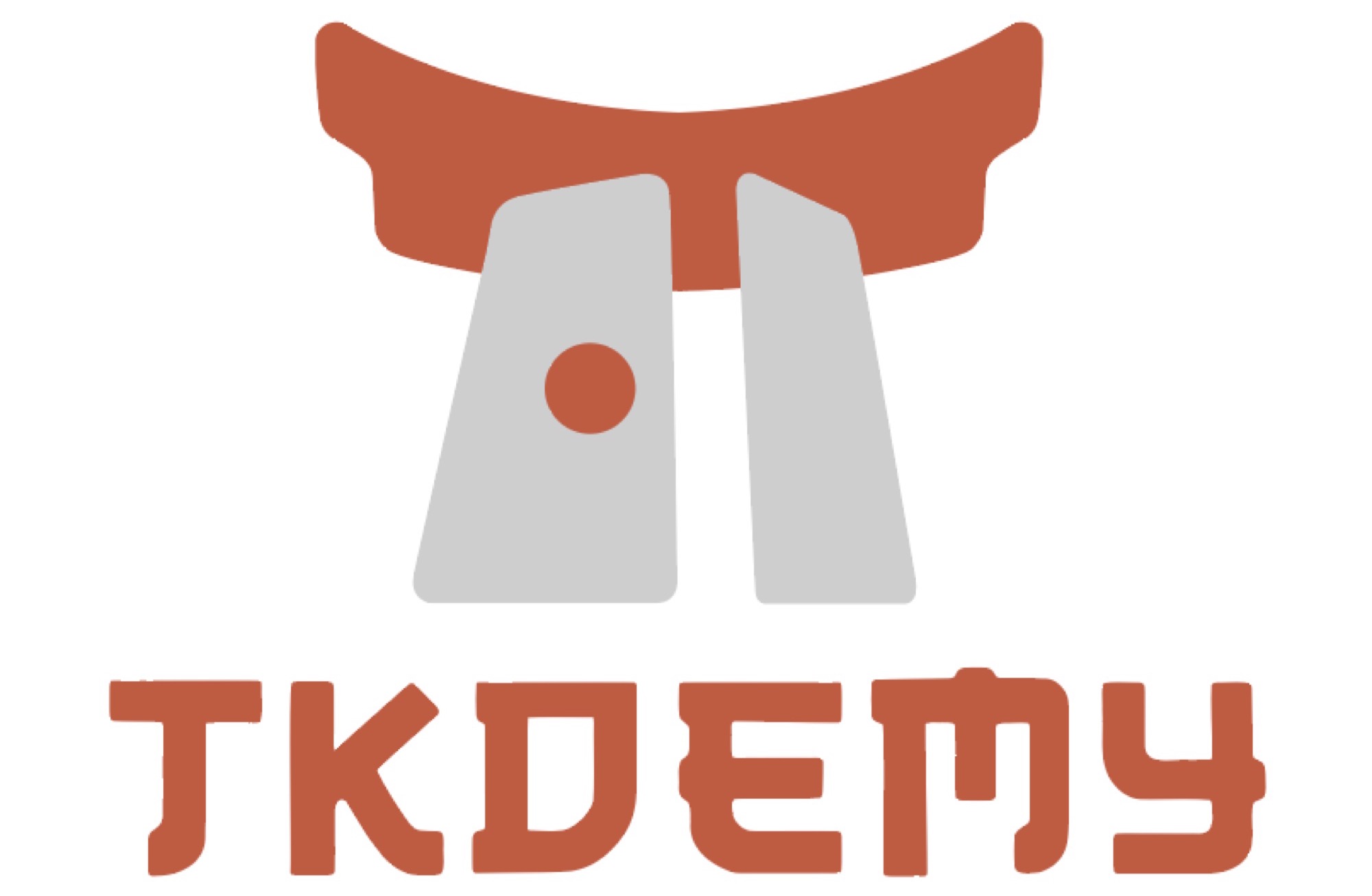
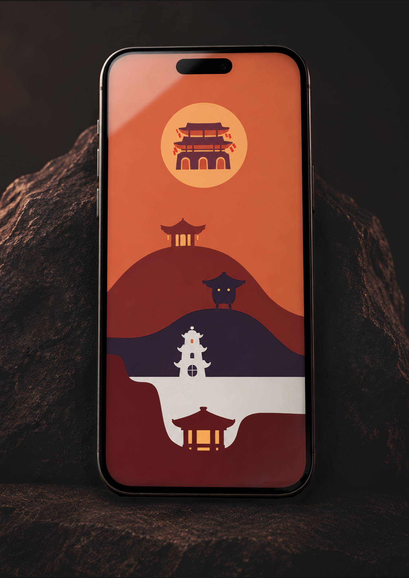
The name joins two words: Taekwondo + Academy. The mark is a pair of gates — the entrance to the academy and the start of the path.
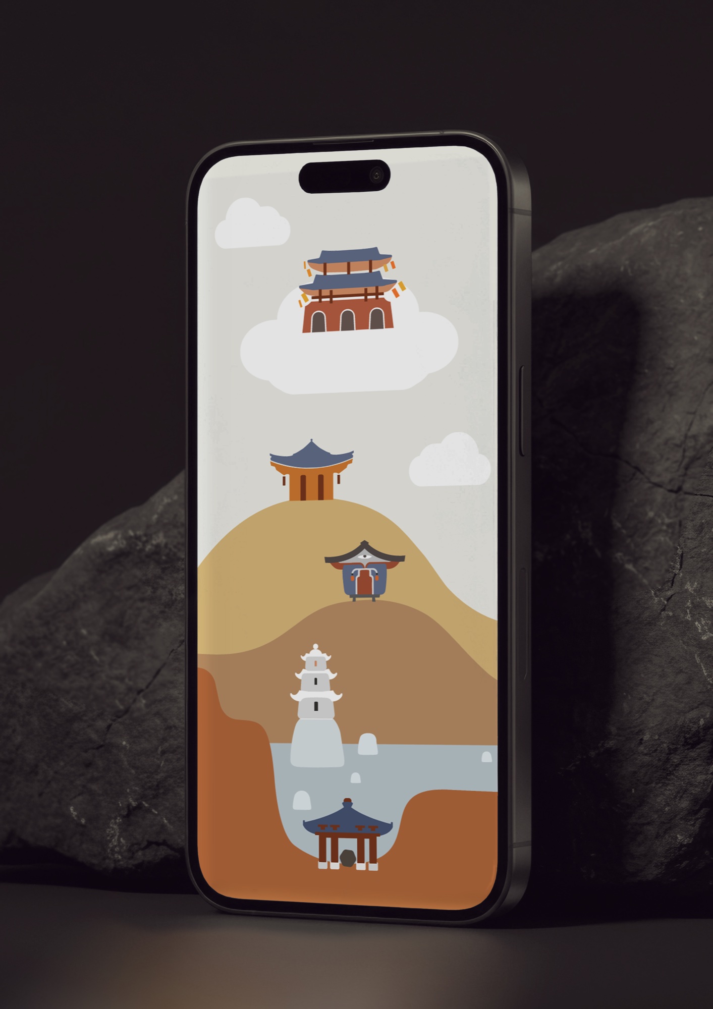
Behind the gates are five Houses: Strength, Endurance, Wit, Flexibility and Wisdom. Each has its own pagoda and its own Guardian, a virtual mentor who guides the student. The world grew bigger than the brief: the Guardians brought a whole mythology with them, and it became a fairy tale for young taekwondo students — An Incredible Journey with a Pot of Kimchi.



AI for the back office.
Resonance automates the paperwork and internal routine of a company with AI. My part was the mark and the first background for their slides.
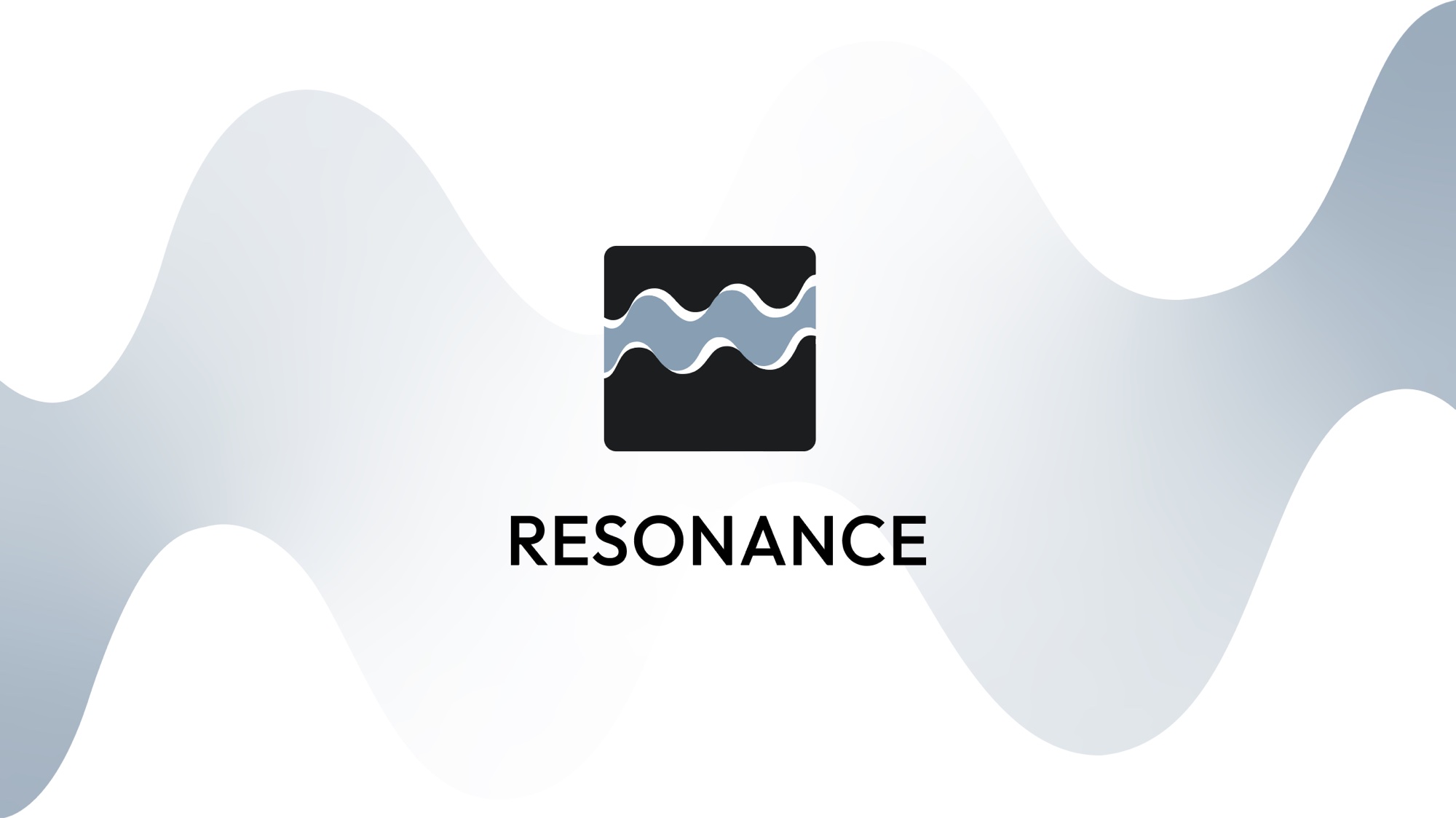
The mark is a black box — but not the kind that hides data. We can look inside. It is shown in cross-section: a wave of information passes through the dark box, enters on one side and exits on the other, transformed by resonance. Its path stays visible — not hidden, but highlighted. The wave that passes through the transformation is resonance itself — the mark names itself.
The work continues: presentation templates and the full visual identity.



Shelfix
On-demand merchandising.
Shelfix works like Uber for merchandising: stores post shelf tasks, and people looking for a side job pick them up nearby.
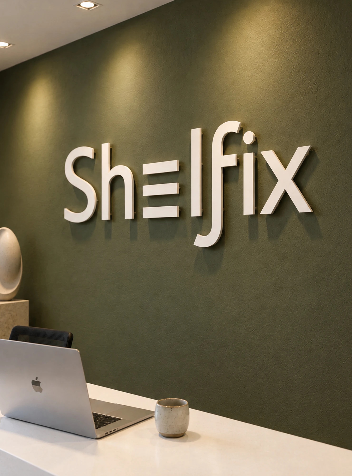
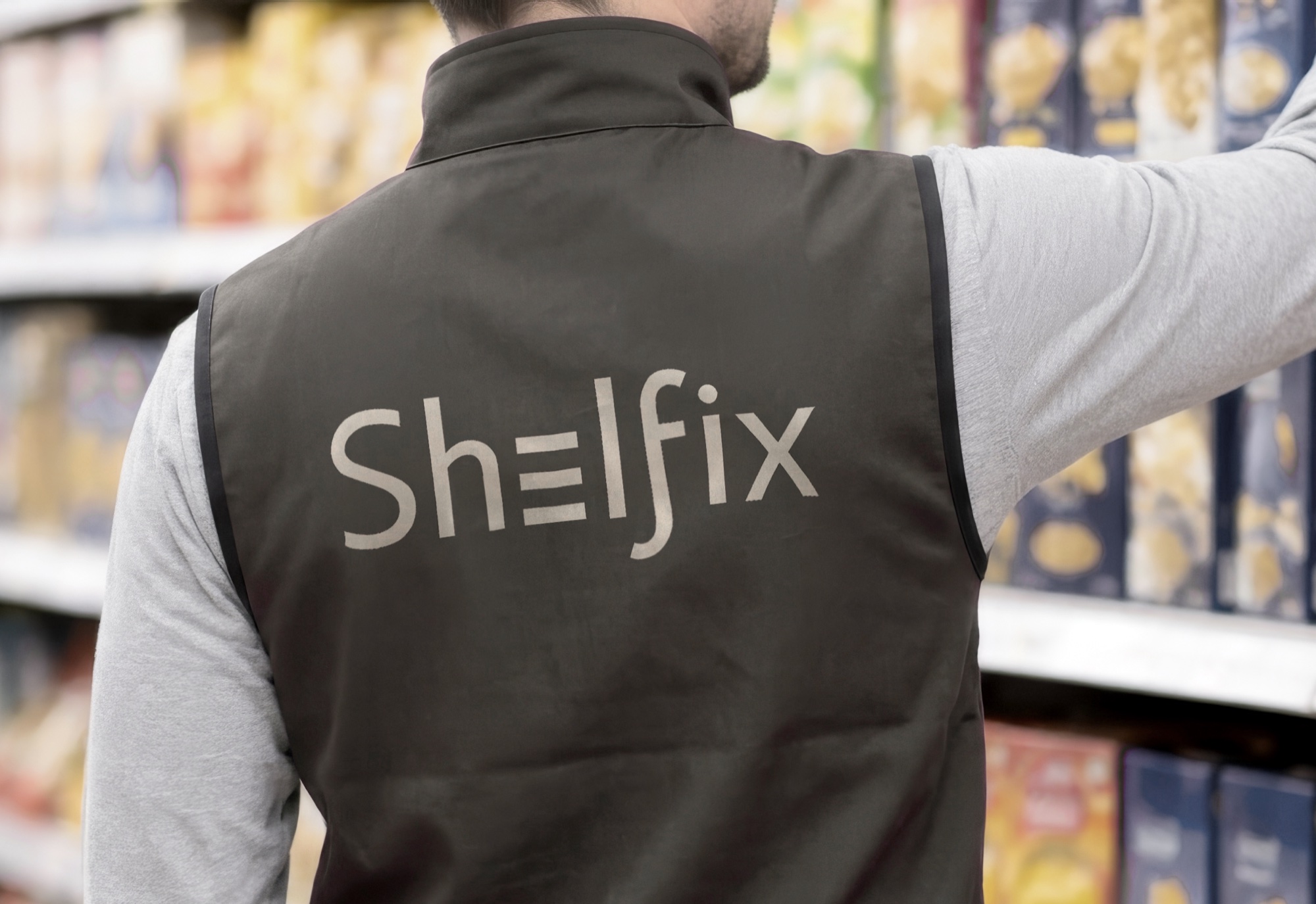
In the name, the E turns into three shelves, and the f bends like a wrench — a small tool for fixing things, just as the name promises. The letters stay simple and calm, so the sign reads at a glance — on an office wall or on the back of a work vest in the aisle.

Songs of Kamchatka
Fine seafood from the edge of the world.

Songs of Kamchatka is a supplier of seafood from the Russian Far East.
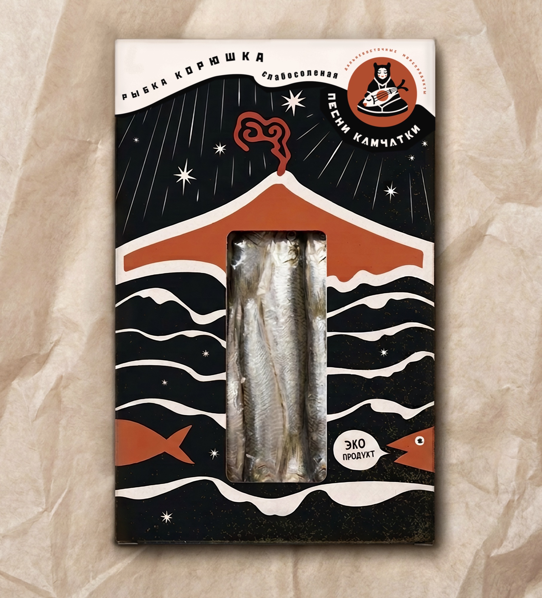
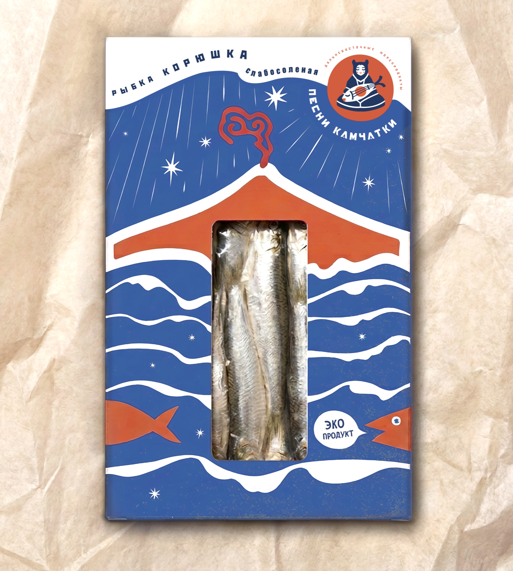
The brand's visual language combines Asian minimalism with the bold, blocky style of the Soviet poster. It carries the spirit of the Far East — the place where Asian and Slavic cultures have long met and mixed.
The name points to the legends and songs of the region's native peoples, so the mark shows a young storyteller. She sits in the pose of a narrator with a fish-lute in her hands — as though she were telling an old tale, singing a Song of Kamchatka.
The packaging keeps to three colors: black, off-white, terracotta. The front is built around a volcano, and its silhouette names the region before the reader reaches any words.

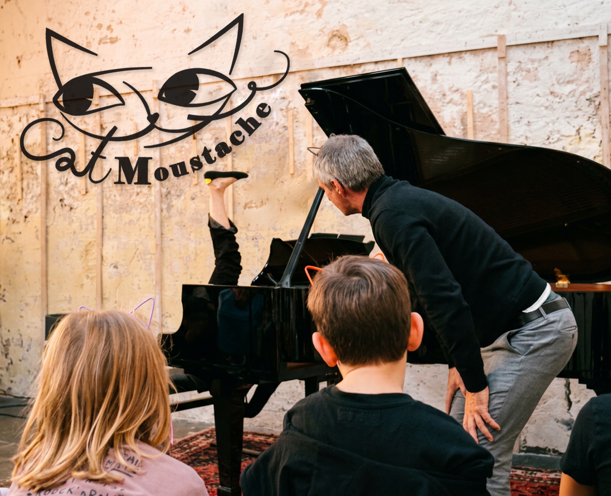
Cat Moustache
A classical music show for children.

"What was that? Do you hear it?" (the first notes of Saint-Saëns' Royal March of the Lion) "Who is that, marching so proudly? Stand up and march like the most important animals in the forest!"
That is how the whole show goes. Eleven more musical adventures lie ahead, and every one begins with a game: the children turn into bumblebees, dive underwater, creep through the hall of the mountain king. It is a concert where nobody has to sit still.
The logo. What was needed was not a mark but a character — a sly cat who leads children into classical music. Dozens of cats were rejected before this one appeared.
His whiskers are made of letters: the word Cat runs out into the left whisker, and the curl on the right is the other one. The cat's name and the cat's face are the same drawing.